
EN
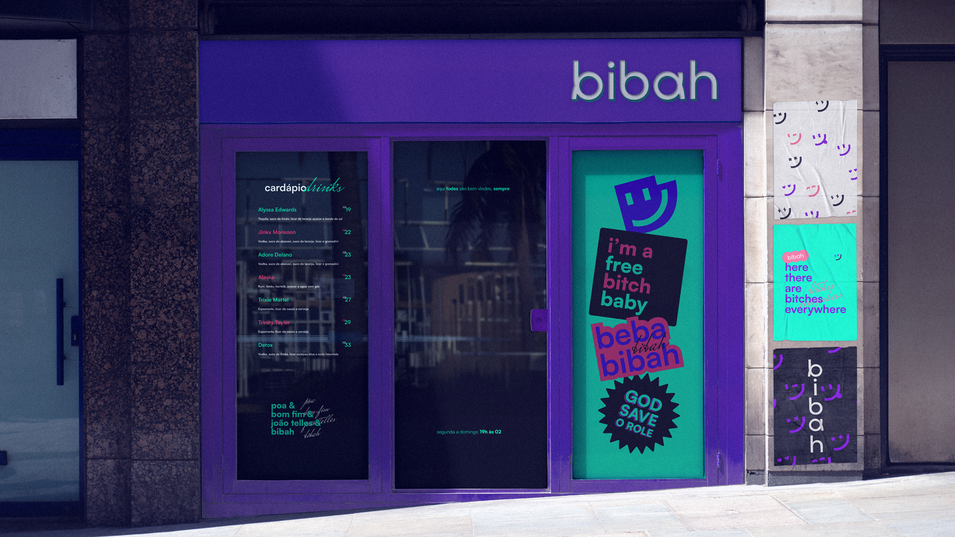
Created with a focus on LGBTQIAP+ culture, Bibah Bar offers a welcoming and vibrant environment located in the Bom Fim neighborhood of Porto Alegre, where each visit is celebrated and warmly received. Bibah has earned its place in the city with its unique atmosphere, providing special moments for everyone.
The Bibah brand represents the fusion of "biba" (a term meaning gay) and "bah" (a strong expression from the gauchos), both challenging and celebrating the culture of Rio Grande do Sul while proudly exalting diversity.
PT-BR
Criado com foco na cultura LGBTQIAP+, o Bibah Bar oferece um ambiente acolhedor e vibrante localizado no bairro Bom Fim em Porto Alegre, onde cada visita é celebrada e acolhida com entusiasmo. Bibah conquistou seu espaço na cidade por sua atmosfera única, proporcionando momentos especiais para todos.
A marca Bibah representa a fusão entre "biba" (termo que significa gay) e "bah" (expressão forte dos gaúchos), desafiando e ao mesmo tempo celebrando a cultura do Rio grande do Sul e exaltando a diversidade com orgulho.

PT-BR
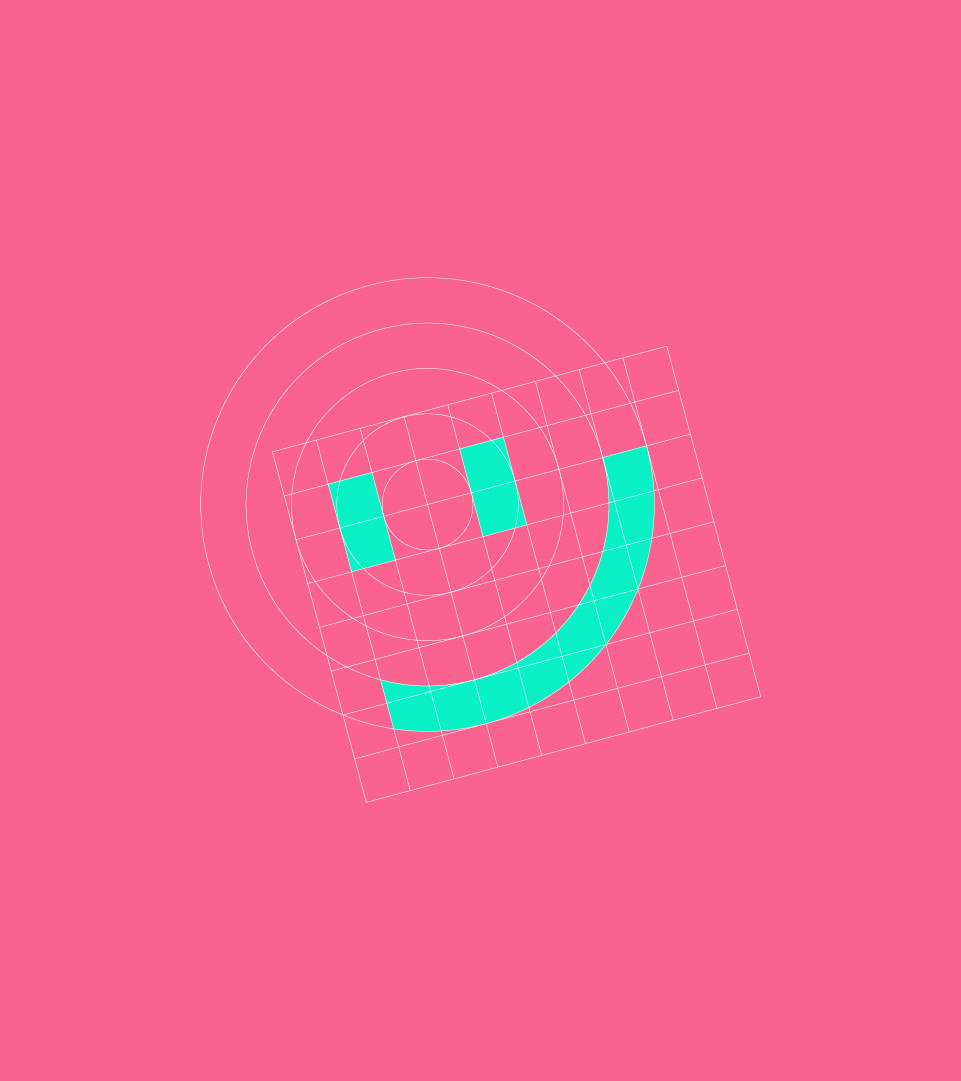
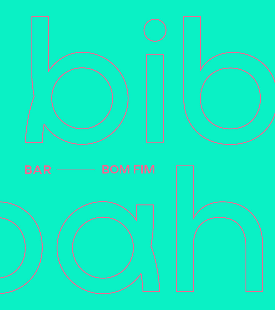
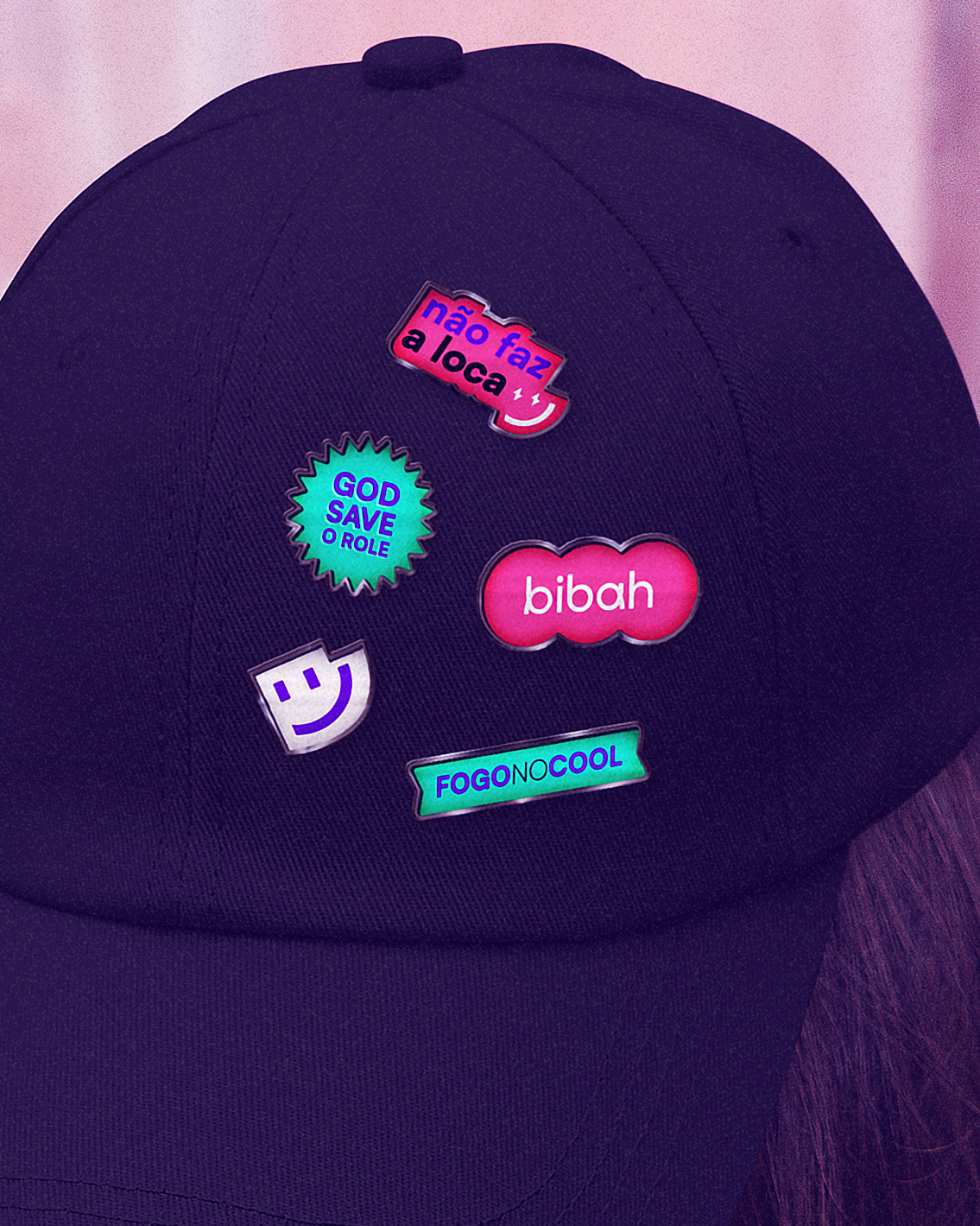
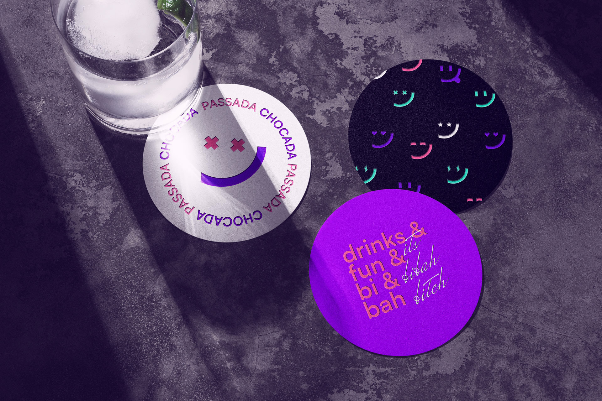
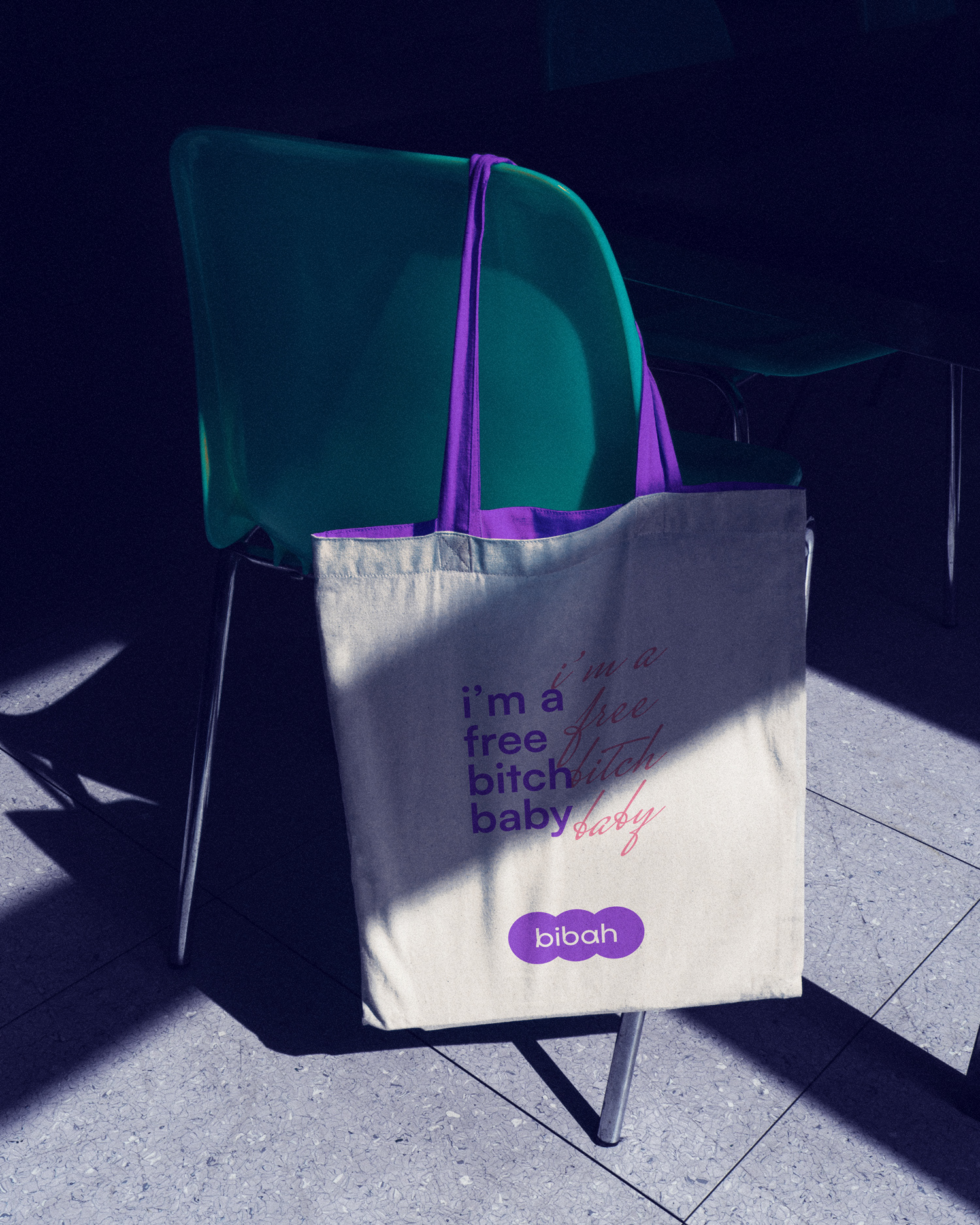
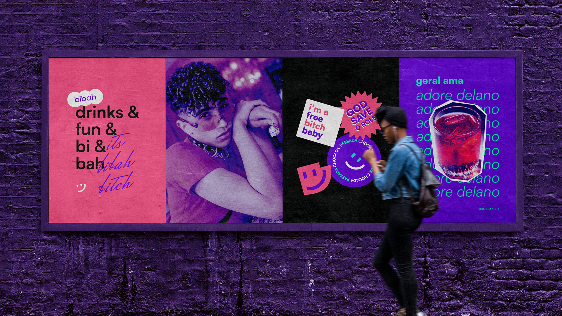
O logotipo utiliza uma tipografia original, com visual moderno e criada para demonstrar o dinamismo da marca, assim como a busca pela proximidade com o público-alvo. No símbolo, a ideia principal buscada foi transmitir, da forma mais simples possível, as diversas reações de pessoas quando estão felizes, mas mantendo o visual simples do símbolo e sem perder a linha visual principal, facilitando tanto a interpretação quanto a variação.
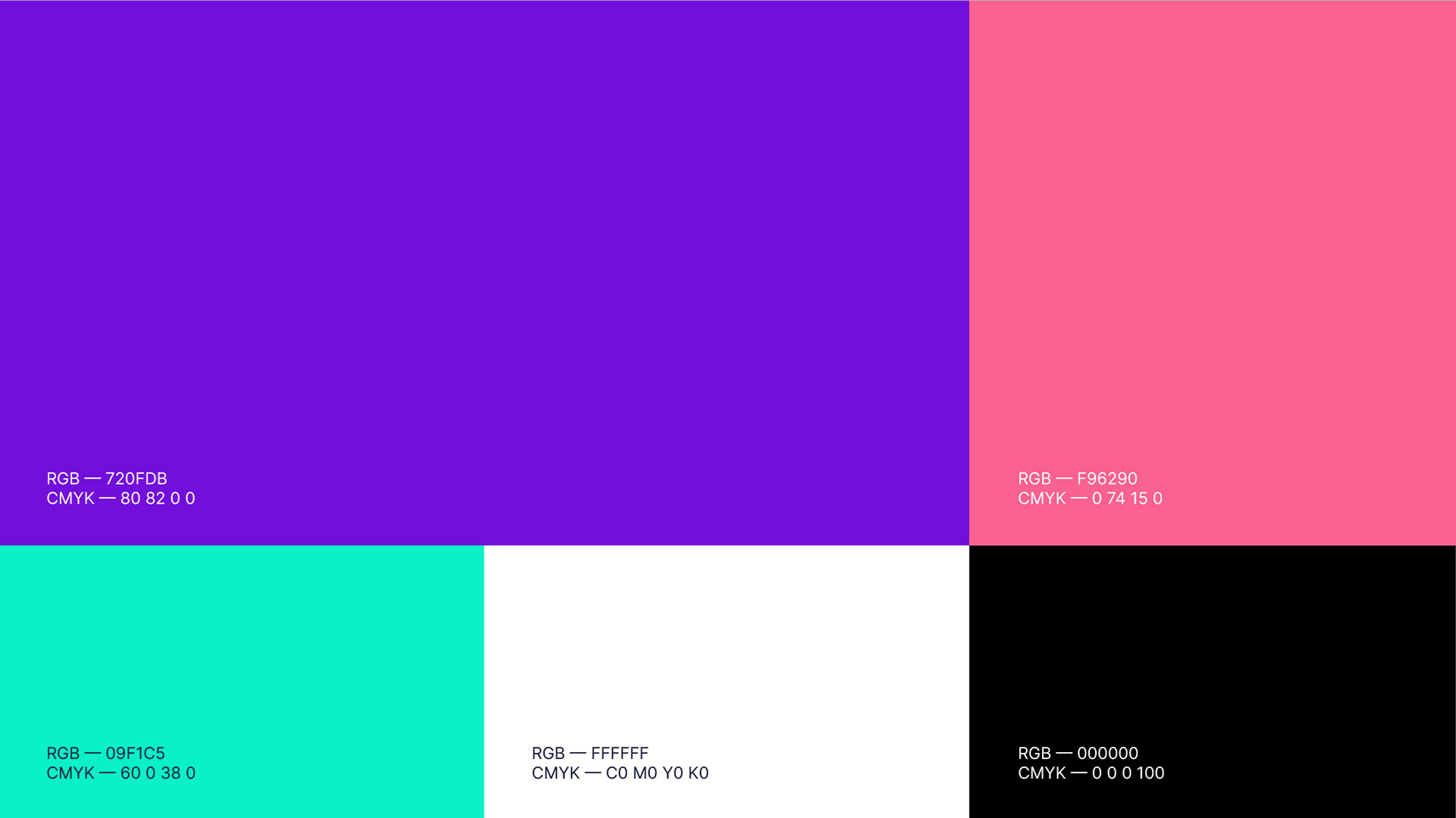
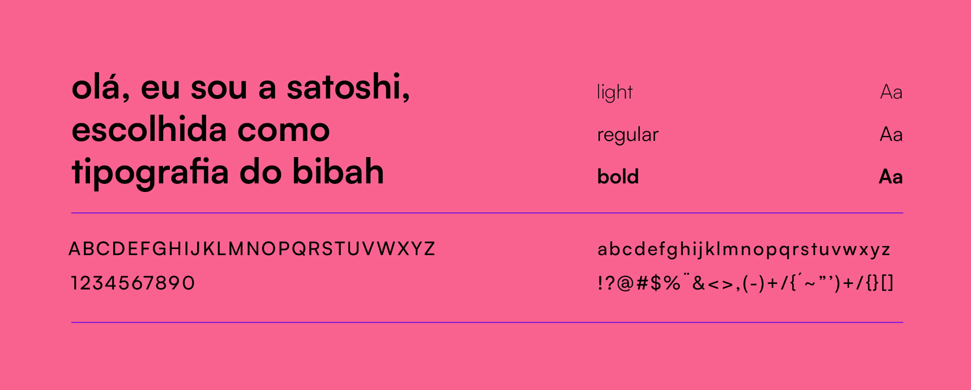
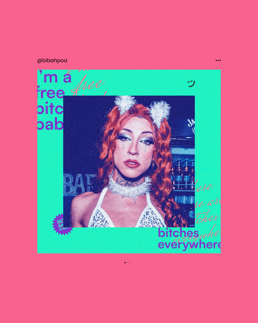
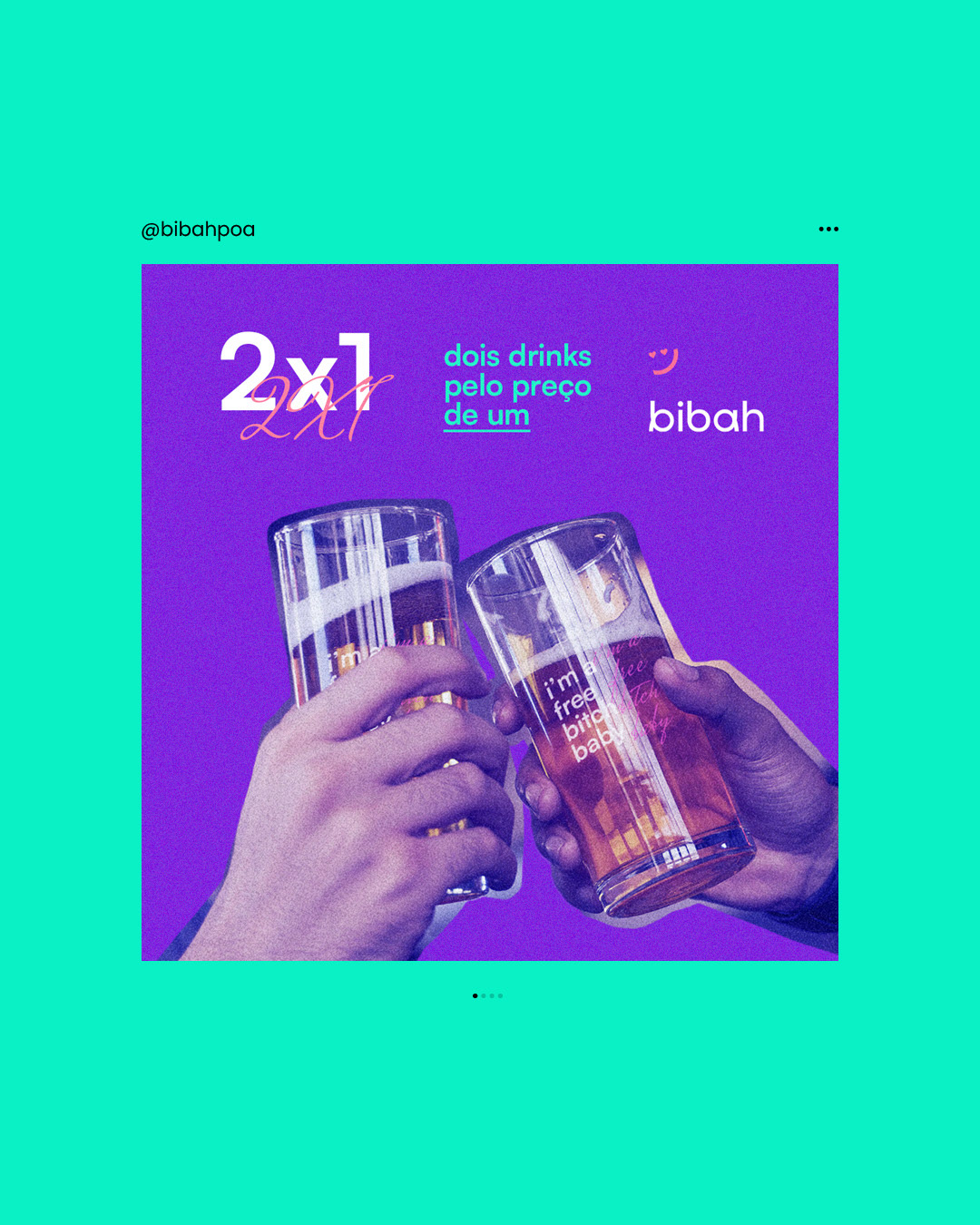
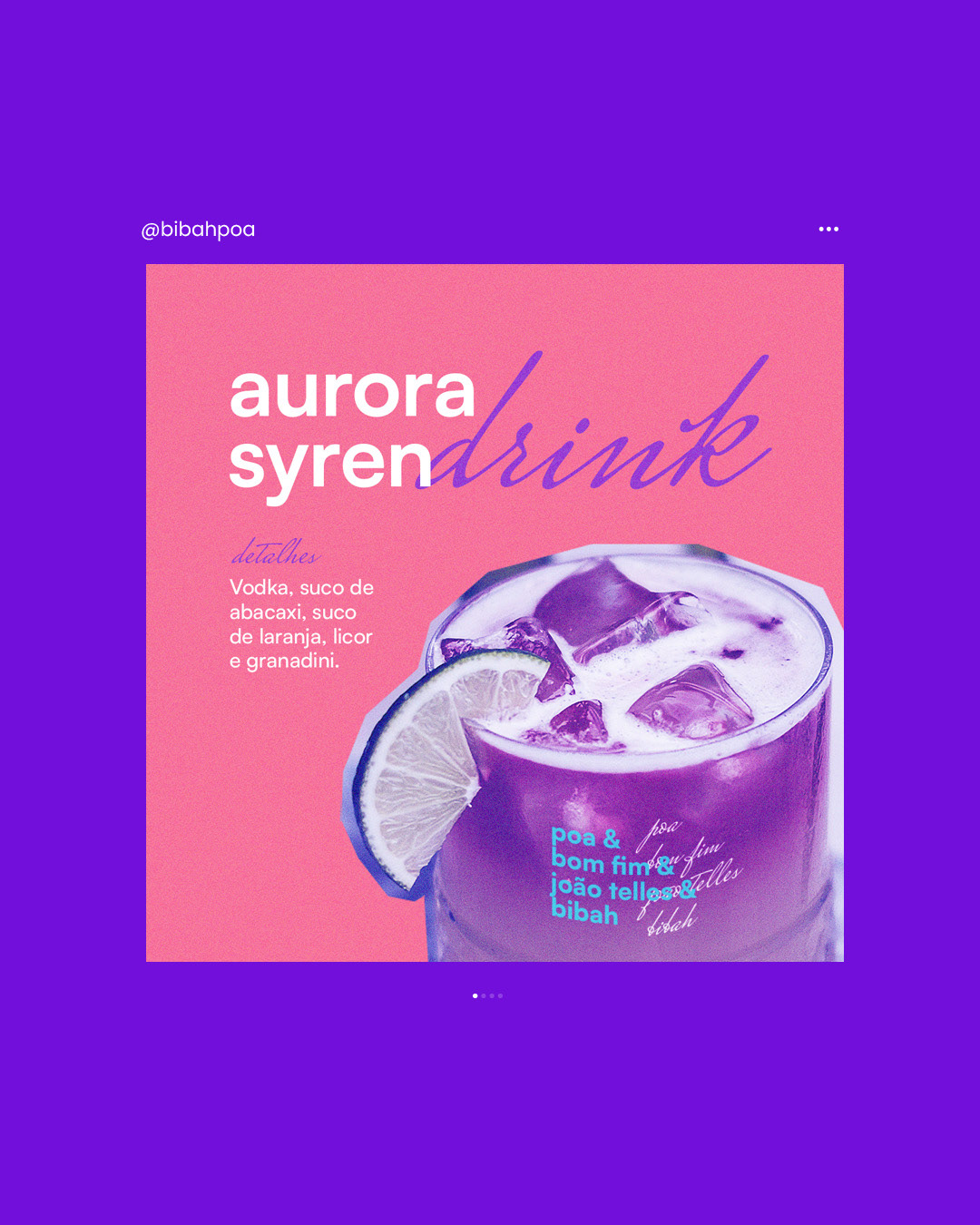
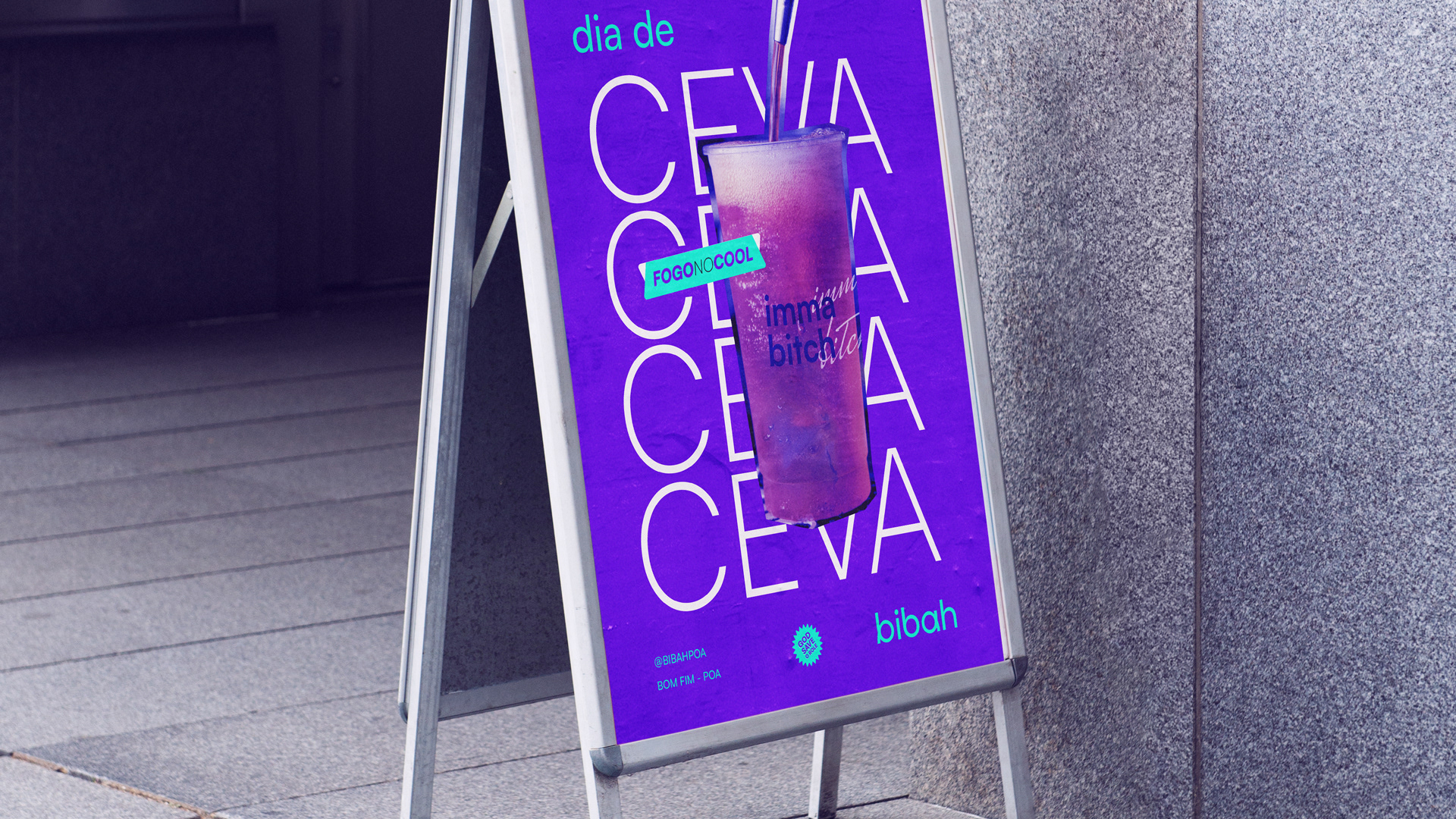
A combinação das cores torna a paleta viva, energética e divertida, refletindo o público-alvo do bar e tornando o ambiente mais atrativo. Isso se alinha com as frases populares tanto entre os frequentadores quanto nas peças de comunicação do bar. Para reforçar essa identidade, foram escolhidas duas tipografias, uma simples para facilitar o uso e outra que se assemelha à caligrafia feita à mão, simbolizando a rebeldia contra o tradicionalismo, utilizada mais como um grafismo.
EN
The logo uses an original typography with a modern look, designed to demonstrate the brand's dynamism and its pursuit of closeness with the target audience. The main idea behind the symbol was to convey, as simply as possible, the various reactions of people when they are happy, while maintaining the symbol's simplicity and the main visual line, facilitating both interpretation and variation.
The combination of colors makes the palette vibrant, energetic, and fun, perfectly reflecting the bar's target audience and making the environment more attractive. This aligns with the popular phrases used by both patrons and in the bar's communication materials. To reinforce this identity, a font resembling handwritten calligraphy was chosen, symbolizing rebellion against traditionalism.

Project: Visual identity | Projeto: Identidade Visual
Fotos: Eco Espaço © Divulgação
Thank you. Obrigado.
Send a message to: contato@douglasalff.com.br
Instagram: @alffdesign
Website: www.douglasalff.com.br