VP Health
PT-BR — Tecnologia, inovação e saúde auditiva em sintonia.
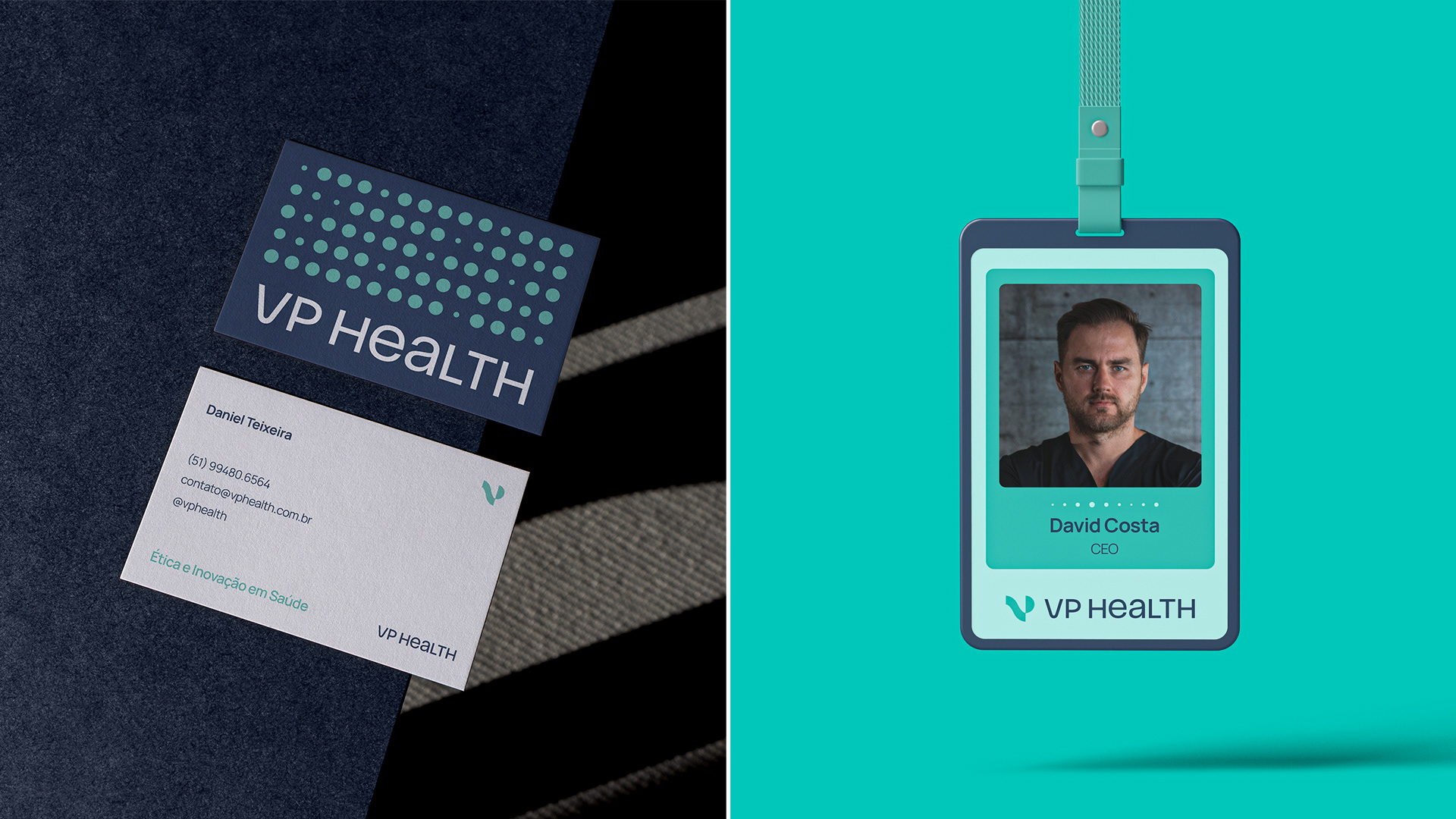
A VP Health é uma marca focada em soluções tecnológicas para diagnósticos auditivos, especialmente voltada ao tratamento de zumbido. A proposta visual traduz exatamente isso: uma marca que une ciência e sensibilidade, sem parecer fria ou distante.
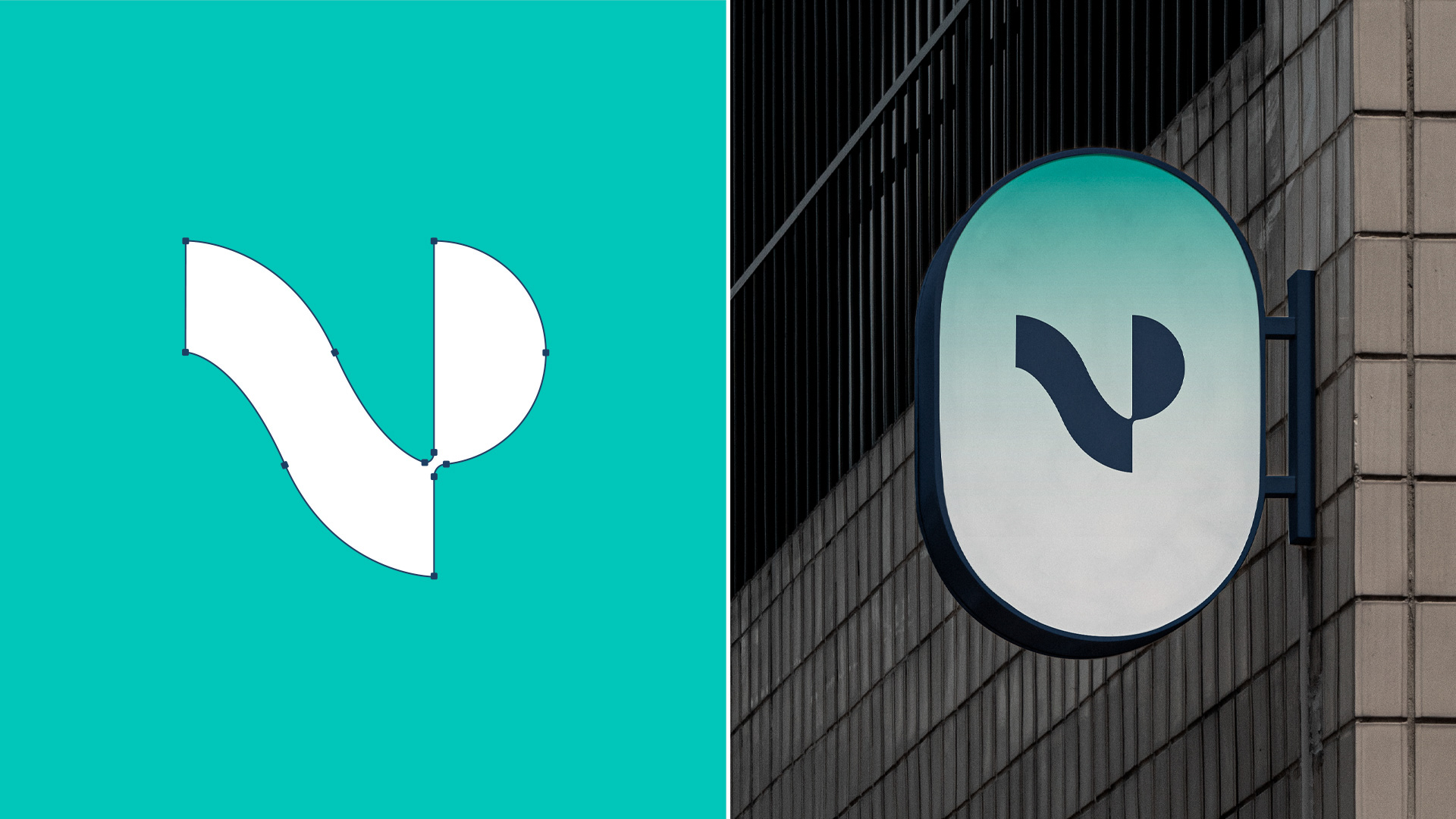
O símbolo foi criado a partir das iniciais V e P, mas com formas que também lembram uma onda sonora ou até mesmo uma cóclea, parte do ouvido responsável pela audição. Ou seja, é uma marca que já comunica visualmente o seu campo de atuação. A tipografia é exclusiva e em versalete, trazendo um ar moderno e diferente.
EN — Technology, innovation, and auditory health in harmony.
VP Health is a brand focused on technological solutions for auditory diagnostics, with a special emphasis on tinnitus treatment. The visual identity reflects this perfectly: a brand that combines science and sensitivity, without coming across as cold or distant.
The symbol was built from the initials V and P, but its forms also resemble a sound wave or even a cochlea — the part of the ear responsible for hearing. In other words, it's a brand that visually communicates its area of expertise. The typography is custom and set in small caps, giving it a modern and distinctive look.

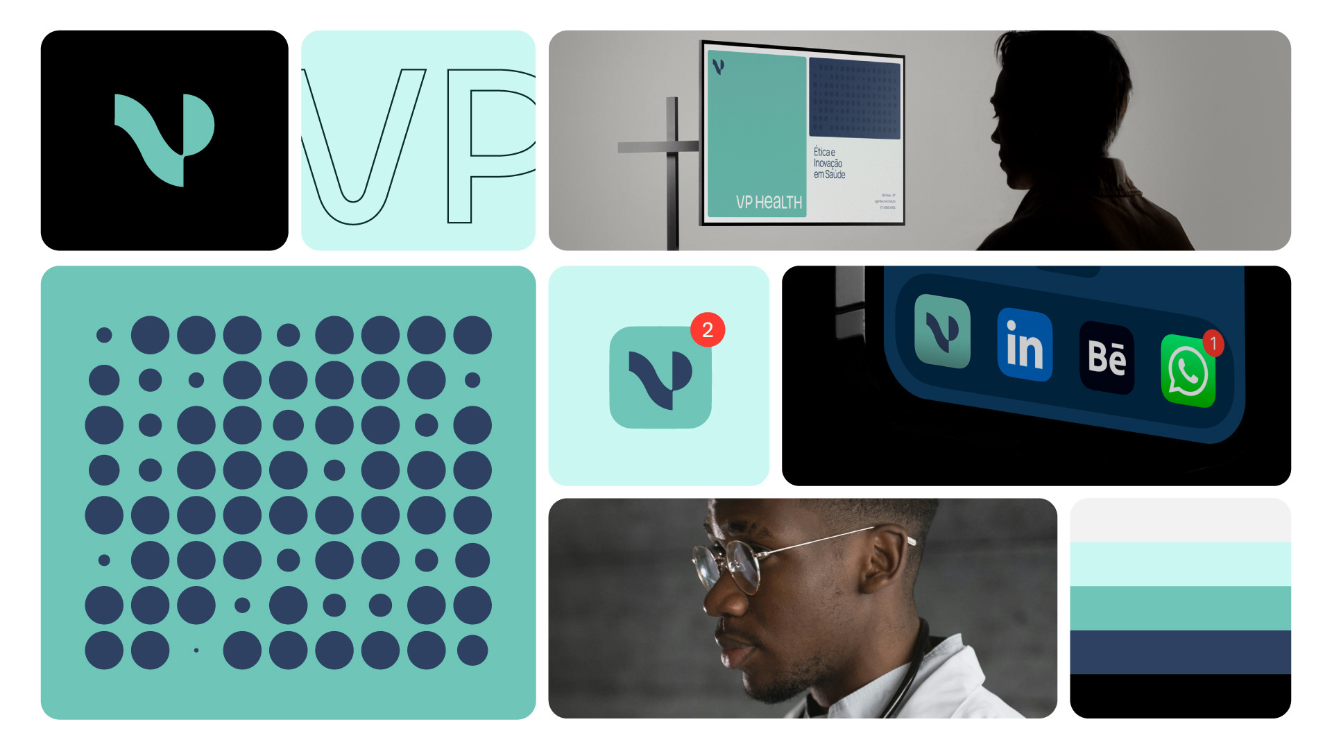


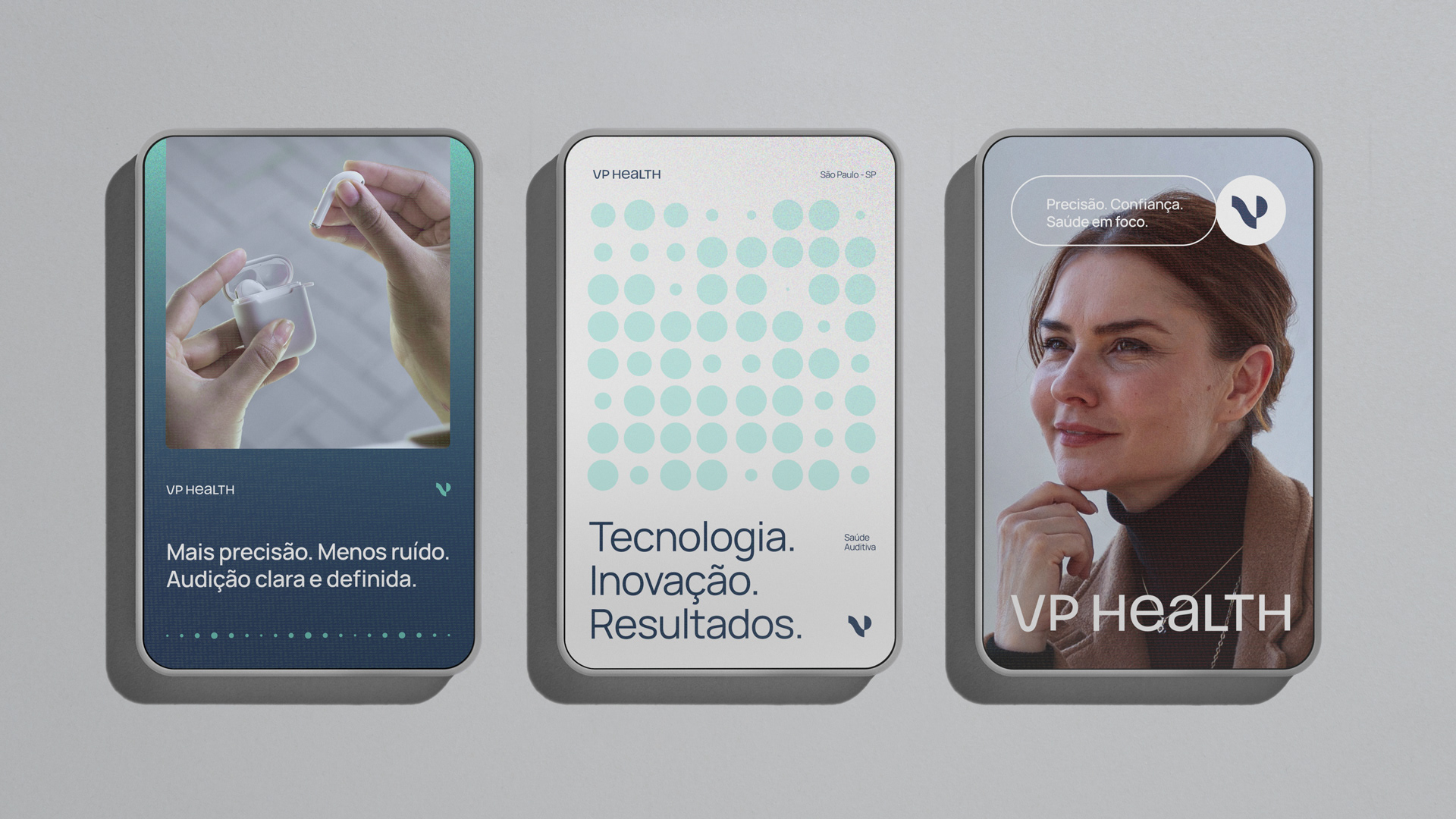
PT-BR — Nos elementos gráficos, foram utilizadas formas arredondadas e círculos que remetem às ondas sonoras e também à ideia de propagação. Tudo pensado para equilibrar a precisão tecnológica com a proximidade humana. A paleta mistura azuis profundos (que transmitem confiança e tecnologia) com tons esverdeados (que trazem frescor, saúde e leveza). Essa combinação ajuda a posicionar a VP Health como uma marca inovadora, mas também acessível e ética. A identidade é direta, fluida e simbólica, assim como os processos que ela propõe: ouvir, diagnosticar e tratar.
EN — In the graphic elements, rounded shapes and circles were used to evoke sound waves and the idea of propagation. Everything was designed to balance technological precision with a human touch. The color palette combines deep blues (which convey trust and technology) with greenish tones (that bring a sense of freshness, health, and lightness). This mix helps position VP Health as an innovative brand that is also accessible and ethical. The identity is straightforward, fluid, and symbolic — just like the processes it promotes: listening, diagnosing, and treating.


Project: visual identity. | Projeto: identidade visual.
Thank you. Obrigado.
Send a message to: contato@douglasalff.com.br
Instagram: @alffdesign
Website: www.douglasalff.com.br
WhatsApp: +55 51 994806564